Introduction and Transformations
Imaging in deep learning for computer vision and classification problems have become a compelling way to impress friends and family, influence strangers and demonstrate the power and adaptability of artificial neural networks and convolutional networks. It can also assist researchers and systems in sorting, segmenting and identifying / classifying data, moving
mundane tasks into the realm of automation and saving graduate students and TAs countless late nights sorting, indexing, checking and eventually spilling coffee all over the entirety of a project.
Image Classification relies on a sample set of images that have been ‘labeled’ with a desired output pictures of cats labeled with ‘cat’, and dogs with ‘dog’. The neural network that has been trained to classify these will learn features that images of cats possess, and will learn other features that identify dog images as dogs. But this requires a large quantity of labeled data; and can have complications what if all cat images have white backgrounds? the network may not even learn to identify features of a cat, but instead will learn that if the image has a white background, it’s a cat.
Using image transformations and some know-how, we can augment an existing dataset, expanding the effective size of the training data pool, and hopefully pushing the network to learn more meaningful features.
Let’s begin by looking at the basics of an imaging package, scikit-image
import numpy as np #numpy represents complex dimensional data as arrays

import matplotlib.pyplot as plt #some standard python plotting

import skimage #our imaging library
grump = skimage.io.imread('turtle.jpg')
using scikit-image’s io module and imread function, we read in an image as a NumPy array of n-dimensions, filled with numbers that represent the pixel locations and color values.
print(type(grump))

print('our image, as a numpy array, is shaped', grump.shape)

plt.figure(figsize = (10, 8))
plt.imshow(grump)
plt.show()

So Scikit-Image’s io.imread function reads in pixel values in the first two dimensions grump.shape[0],
grump.shape[1], and RGB color channels in the third dimension,
grump.shape[2].
So to represent the image we have a set of three values for each pixel ‘location’
This means our image will have 667 values pixels – this first dimension is the number of rows, which might be counter-intuitive for you it is for me. The number of rows corresponds to the Y axis of the image.
The second dimension will be the X, and the final dimension, grump.shape[2],
contains values for the color channels, Red Green and Blue, or RGB. Scikit-Image has multiple
color spaces, including RGBA, HSV, XYZ, CIE, and grayscale, and supports conversion between
them easily.
So let’s just look at some of those specific pixel values
print(grump[50, 50, :]) #look at all RGB values for a specific array index, or one pixel's RGB value.
print("these three numbers in brackets represent one pixel's values for a specific location in the image array.")

'''and let's index into a specific section of the image array'''
print("let's look at the first 5 pixels in the x and y axis")
plt.imshow(grump[:5, :5, :])
plt.show()
print(grump[:5, :5, :])

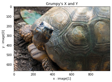
Let’s take a closer look at our shell-buddy
plt.imshow(grump)
plt.title("Grumpy's X and Y")
plt.xlabel('x : image[1]')
plt.ylabel('y : image[0]')
plt.show()
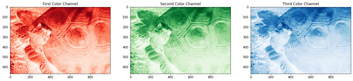
#And now let's take a look at the individual channels of the image.
plt.figure(figsize = (20, 15))
plt.subplot(1,3,1)
plt.imshow(grump[:, :, 0], cmap = 'Reds')
plt.title('First Color Channel')
plt.subplot(1,3,2)
plt.imshow(grump[:, :, 1], cmap = 'Greens')
plt.title('Second Color Channel')
plt.subplot(1,3,3)
plt.imshow(grump[:, :, 2], cmap = 'Blues')
plt.title('Third Color Channel')
plt.show()
 >
>
 >
>
Ok, well, maybe the color channels would be better represented with a different image. But I do love this tortoise-friend. Let’s use a much more illustrative, albeit inferior, non-testudinidae-friendly image.
test_img = skimage.io.imread('trial.jpg')

plt.figure(figsize = (18, 8))
plt.subplot(1,4,1)
plt.imshow(test_img)
plt.title("Testing Image")
plt.subplot(1,4,2)
plt.imshow(test_img[:, :, 0] - (test_img[:, :, 1] + test_img[:, :, 2]), cmap = 'Reds')
plt.title("Red Channel")
plt.subplot(1,4,3)
plt.imshow(test_img[:, :, 1] - (test_img[:, :, 0] + test_img[:, :, 2]), cmap = 'Greens')
plt.title("Green Channel")
plt.subplot(1,4,4)
plt.imshow(test_img[:, :, 2] - (test_img[:, :, 0] + test_img[:, :, 1]), cmap = 'Blues')
plt.title("Blue Channel")
plt.show()

Ok, another point worth delving into – why did I have to subtract some channels from the others
to get something to display in the above example? Well, in this image we’re working in RGB –
colors are represented by a set of integers or float values. Combining the three RGB channels –
a red value of 0 to 255, Green value of 0 to 255, and Blue value of 0 to 255. A white pixel
would be represented in the three channels by [255, 255, 255], and black would be
[0, 0, 0]
So when we go to plot, say, the red channel test_img[:, :, 0], if we have a fully or
very close to fully red object as we do in this test image, it would be represented by a
single pixel value of 255, and a fully white pixel would be represented, in the red
channel, by 255. So our red values would appear identical to our white pixels!
Something to keep in mind if you hit some weird display bumps in the road while dealing with
color images!
Back to Turtle, errr, Tortoise… Power!
Color is great and all, very nice, but for many purposes, we can get by with grayscale values – we’re eliminating a huge amount of the array’s data by converting – instead of holding 3 color values, it will only hold a single value per pixel.
Another aspect to note – before we get away from color channels – these don’t have to hold different colors. You could put different image processing techniques or different images entirely into different channels. Anything you can turn into an array, you can assign to a channel, since in NumPy it’s just another dimension.
Matplotlib’s Pyplot uses value maps called colormaps to display an image or data in different ways – these are worth examining when you’re doing any data or image representation. Default pyplotting of a black and white image will give you some crazy high-contrast colors, which can really be nice, but be sure to use the cmap argument if you want a more tame or interpretable representation.
grump_bw = skimage.color.rgb2gray(grump)
grump_bw = skimage.util.img_as_float32(grump_bw)

plt.figure(figsize = (20, 8))
plt.subplot(1,3,1)
plt.imshow(grump)
plt.xlabel('Original RGB')
plt.subplot(1,3,2)
plt.imshow(grump_bw)
plt.xlabel('Grayscale with default colormap')
plt.subplot(1,3,3)
plt.imshow(grump_bw, cmap = 'gray')
plt.xlabel('Grayscale in 32-bit')
plt.show()

So why convert into float 32? weren’t we working in 64? or int values for the org image? Yes. Yes we were. Some image operations and processes will require specific array value types, and some will output different types, so knowing what you’re working in is important.
Use numpy’s dtype property!
print('grump.dtype = ', grump.dtype)
print('grump_bw.dtype = ', grump_bw.dtype)
print('grump_bw_scaled.dtype = ', grump_bw.dtype)
Congratulations, we have some of the basics of the basics covered, we can move on to the cool stuff that Scikit-Image is capable of! Let’s expose that tortoise! No… no, that came out wrong. We’re going to maximize exposure… no… no, again. Scikit-Image’s exposure module contains a bunch of useful image processes that will really get us into fighting shape.
skimage.exposure.___()
rescale = skimage.exposure.rescale_intensity(grump_bw)
#stretches the values in the image, setting the highest values to maximum allowed by datatype, and lowest to minimum

eqhist = skimage.exposure.equalize_hist(grump_bw)
#histogram equalization will generally 'squash' intensity values to bump up the contrast over the whole image

adapthist = skimage.exposure.equalize_adapthist(grump_bw, clip_limit = .5)
#adaptive version of the eqhist - this will use the same 'squash and bump', but across sections of the image

sigmoid = skimage.exposure.adjust_sigmoid(grump_bw)
#sigmoidal contrast adjustment to rescale intensity values

log = skimage.exposure.adjust_log(grump_bw)
#Logarithmic contrast adjustment to rescale intensity values


plt.figure(figsize = (20, 8))
plt.subplot(2,3,1)
plt.imshow(grump_bw, cmap = 'gray')
plt.title('OG Grump in 32-bit glory')
plt.xlabel(str(grump_bw.dtype))

plt.subplot(2,3,2)
plt.imshow(eqhist, cmap = 'gray')
plt.title('Equalize Histogram')
plt.xlabel(str(eqhist.dtype))

plt.subplot(2,3,3)
plt.imshow(adapthist, cmap = 'gray')
plt.title('Equalize Adaptive Histogram')
plt.xlabel(str(adapthist.dtype))

plt.subplot(2,3,4)
plt.imshow(rescale, cmap = 'gray')
plt.title('Rescale Intensity')
plt.xlabel(str(rescale.dtype))

plt.subplot(2,3,5)
plt.imshow(log, cmap = 'gray')
plt.title('Logarithmic Gamma Adjustment')
plt.xlabel(str(log.dtype))

plt.subplot(2,3,6)
plt.imshow(sigmoid, cmap = 'gray')
plt.title('Sigmoid Gamma Adjustment')
plt.xlabel(str(sigmoid.dtype))
plt.tight_layout()
plt.show()

Each of these processes has a place in different applications, but for scientific purposes,
rescaling intensities, histogram equalizing and the adaptive version of histogram equalizing
tend to have a leg up in a lot of applications, including many Machine Learning processes, by
maximizing / minimizing contrast across sections of the image, we have a much more obvious
representation of potential features. I mean, just look at Grump’s beautiful, shimmering shell
detail in the adaptive histogram equalization – top right above.